A visualisation of nuclear testing through history
Inspired by my recent viewing of Oppenheimer
Author
Johnny Breen
Published
August 17, 2023
subscribe.html
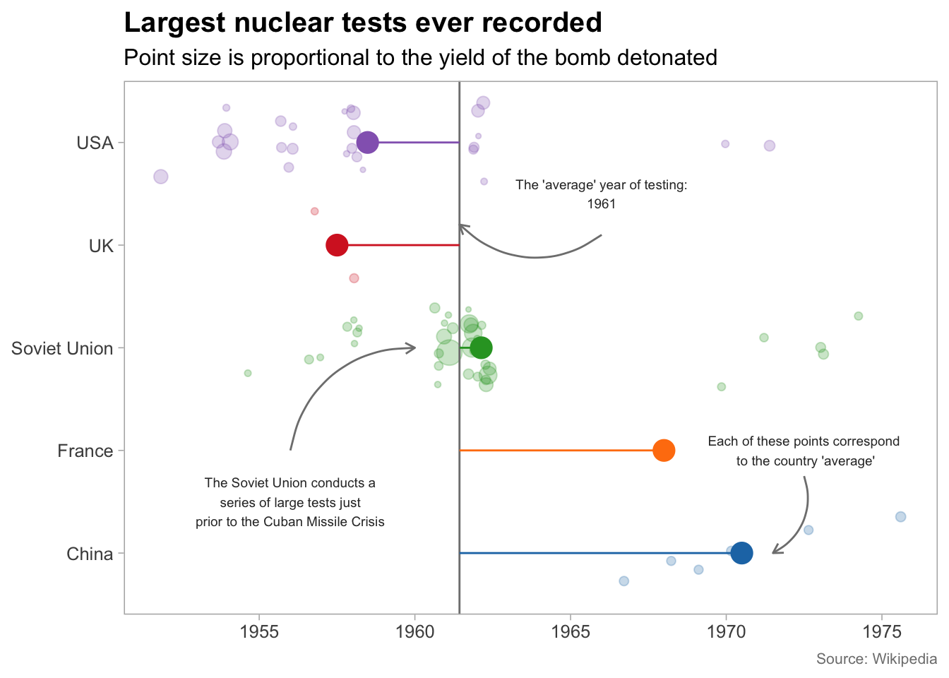
I recently went to the cinema to watch Oppenheimer. Apart from being a compelling viewing experience, it also made me wonder more about the history of nuclear weapons testing and how it evolved over time from Trinity to the present day.
Luckily enough there is a fantastic Wikipedia entry which contains some data in a tabular format charting the ‘largest’ nuclear weapons tests ever recorded in history.
I was able to grab this data using rvest, clean it up with tidyverse tooling and plot the results using ggplot2!
A visualisation of how nuclear testing has evolved over time is shown below (you can optionally view the accompanying code should you wish to see how this was done),
Code
#### Short analysis of nuclear testing ######## Background ##### This script performs a short analysis of the largest nuclear tests ever recorded, according to Wikipedia#### Setup ###### Load packages ##required_packages <-c("tidyverse", "rvest", "xml2", "janitor", "extrafont", "ggsci", "glue")for (pkg in required_packages) {if (!pkg %in%installed.packages()) {install.packages(pkg, dependencies =TRUE) }library(pkg, character.only =TRUE)}rm(pkg)## Define relevant input parameters ##url <-"https://en.wikipedia.org/wiki/List_of_nuclear_weapons_tests"#### Load data ####nuclear_tests_raw <- xml2::read_html(url) %>% rvest::html_nodes("table") %>% purrr::map(~html_table(., fill =TRUE)) %>% purrr::pluck(3)#### Clean data ####nuclear_tests_clean <- nuclear_tests_raw %>% janitor::clean_names() %>%mutate(date_gmt = lubridate::mdy(date_gmt)) %>%select(-name_or_number) %>%as_tibble()avg_year <- nuclear_tests_clean %>%summarise(avg_year =mean(lubridate::year(date_gmt))) %>%pull()avg_by_country <- nuclear_tests_clean %>%group_by(country) %>%summarise(avg_year_country =mean(lubridate::year(date_gmt), na.rm =TRUE),avg_yield_country =mean(yield_megatons, na.rm =TRUE)) %>%ungroup()#### Visualise data ###### Load fonts ##extrafont::loadfonts()## Set theme ##theme_set(theme_light(base_size =12, base_family ="Arial"))## Create arrows ##arrows <-tibble(x_start =c(4.1, 2, 1.75),y_start =c(1966, 1956, 1972.5),x_end =c(4.2, 3, 1),y_end =c(avg_year, 1960, 1971.5))set.seed(123) # NB: required for the geom_jitter() functionnuclear_viz <-ggplot(nuclear_tests_clean, aes(x = country, y = lubridate::year(date_gmt), colour = country)) +geom_jitter(aes(size = yield_megatons), alpha =0.25, width =0.40) +geom_hline(aes(yintercept = avg_year), colour ="gray50", size =0.5) +geom_segment(mapping =aes(x = country, xend = country, y = avg_year_country, yend = avg_year), data = avg_by_country) +geom_curve(data = arrows, aes(x = x_start, y = y_start, xend = x_end, yend = y_end),arrow =arrow(length =unit(0.08, "inch")), size =0.5,colour ="gray50", curvature =-0.4) +stat_summary(fun.y = mean, geom ="point", size =5) +coord_flip() +scale_colour_d3() +scale_y_continuous(breaks =seq(1950, 1980, 5)) +labs(x =NULL,y =NULL,title ="Largest nuclear tests ever recorded",subtitle ="Point size is proportional to the yield of the bomb detonated",caption ="Source: Wikipedia") +theme(legend.position ="none",plot.title =element_text(size =15, face ="bold"),plot.caption =element_text(size =8, colour ="gray50"),panel.grid =element_blank()) +annotate("text", x =4.5, y =1966, size =2.5, colour ="gray20", label = glue::glue("The 'average' year of testing:\n{round(avg_year)}")) +annotate("text", x =1.5, y =1956, size =2.5, colour ="gray20", label ="The Soviet Union conducts a\n series of large tests just \nprior to the Cuban Missile Crisis") +annotate("text", x =2.00, y =1972.5, size =2.5, colour ="gray20", label ="Each of these points correspond\n to the country 'average'")nuclear_viz
I found it a fun experience to create this plot. Each country tells a story of course, with Russia being the most notable one - look at that cluster of large tests just prior to the Cuban Missile Crisis!