
When I first began writing this post, I initially intended for it to be a ‘how-to’ article on plotting theoretical distributions in R.
That was until I experienced a pretty surprising revelation when delving into the world of day-on-day stock returns.
Take a look at these plots,
Each plot shows the distribution of percentage changes in daily closing prices across four major European stock indices from the period of 1991 to 1998 (grouped into buckets for the purpose of plotting a histogram). A percentage change for one day is simply \(S_{t+1} / S_t\) where \(S_t\) is the stock price as at time \(t\).
As is visible from the plots, the most frequently observed change hovers around 100% i.e. each stock index doesn’t really change that much day-on-day, which is to be expected on such a short time horizon. Occasionally, however, the index experiences a percentage change that is ‘out of the ordinary’ (i.e. > 2%) but, as the respective histograms show, this is still a relatively rare incident.
What surprised me about these plots is that they all appear to be centered around a value of 100% with a roughly equal spread in each direction i.e. they resemble a traditional ‘bell curve’. We’re taught to be naturally ‘vigilant’ of seemingly normal distributions in empirical analyses: how could the data be showing me this?
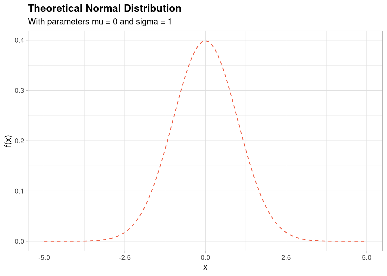
For reference, here is what a ‘standard’ (mean of 0 and standard deviation of 1) normal distribution looks like,
This shape looks very similar to the histogram shapes of the stock indices plotted in the above. But is it the same distribution?
The answer is technically ‘No, not necessarily’. But the reason as to why requires a little more background.
The log-normal distribution
Let’s revisit the theoretical normal distribution shown above - this time, let’s add a ‘density’ of normally distributed points along the \(x\) axis of the graph,
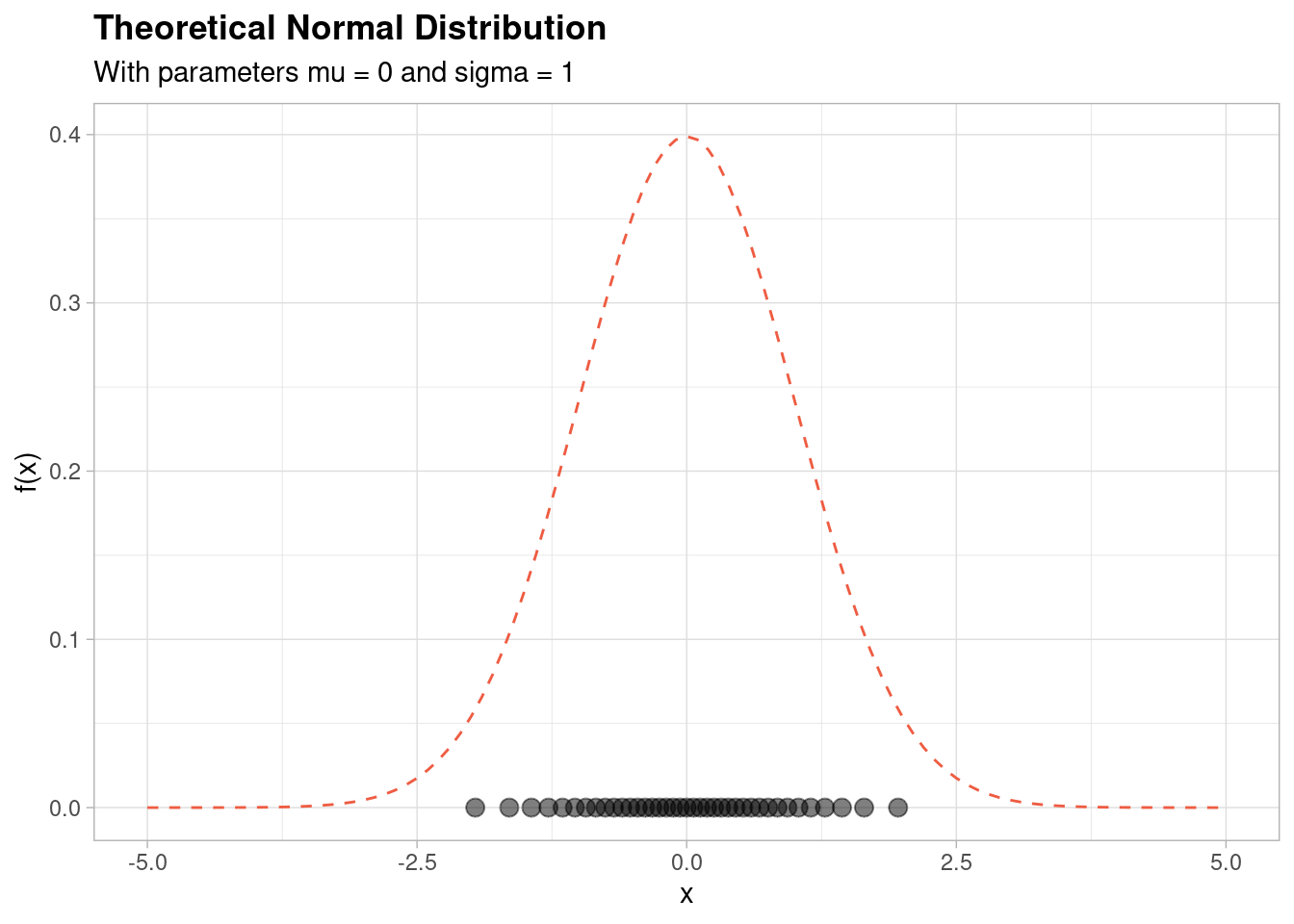
As you can see, the reason that the normal distribution has this shape is that there is a relatively high density of points centred around the mean (which in this case is equal to zero).
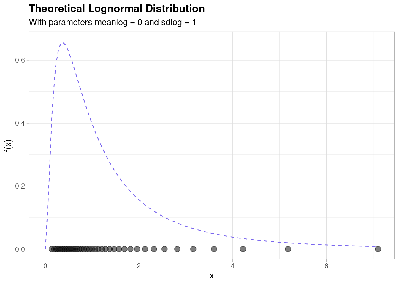
The log-normal distribution is closely related to the normal distribution: a random variable is log-normally distributed if the log of the random variable is normally distributed. Equivalently, if a random variable is normally distributed then the exponential of the random variable is log-normally distributed.
Using the latter fact we can demonstrate what the log-normal actually looks like by ‘stretching’ the graph shown above - we do that by taking the exponential. This leads to the following picture,
The relationship between the normal and log-normal distributions is part of the intuition behind the log-normal distribution. This relationship says that if the mulitiplicative or magnitudinal differences between your random variable of interest (e.g. a financial balance, say) are equally ‘spread out’ in a roughly ‘normal’ distribution, then your variable is likely to be following a ‘log-normal’ distribution.
The log-normal distribution is important in the description of natural phenomena. Many natural growth processes are driven by the accumulation of many small percentage changes which become additive on a log scale. Under appropriate regularity conditions, the distribution of the resulting accumulated changes will be increasingly well approximated by a log-normal - if you remember the Central Limit Theorem that underpins the formation of the normal distribution, this fact might make a lot more sense to you.
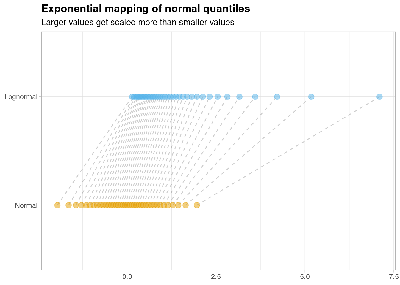
You can also plot the relationship between the normal and log-normal distributions on a single plot by showing how each ‘normally’ distributed point becomes ‘lognormal’ by taking the exponential of each random normal variate,

Larger values get ‘stretched’ out more than smaller values due to the shape of the exponential curve.
What is most interesting about this graph however, is how the ‘slope’ of these connecting lines changes as the value of the \(x\) axis increases. Notice that the slope of line is fairly consistent for values of \(x\) that are closer to zero; as you increase the value of \(x\) however, things change more dramatically.
What is happening here? To answer that question, we need to temporarily go back to the theory of mathematics!
Approximations
If you studied mathematics in high school you might remember the Taylor series expansion of \(exp(x)\), which is often written as follows,
\[ exp(x) = 1 + x + \frac{x^2}{2!} + \frac{x^3}{3!} + ... \] As a result, when \(x\) is very, very small,
\[ exp(x) \approx 1 + x \]
This is because the higher order terms become insignificant as \(x\) becomes tiny.
In other words, the exponential curve is basically a straight line with a intercept of \(1\) for very small values of \(x\). You can see this on a graph if you plot it - the straight line is plotted as a red dashed line and the exponential function is plotted as a standard exponential curve,
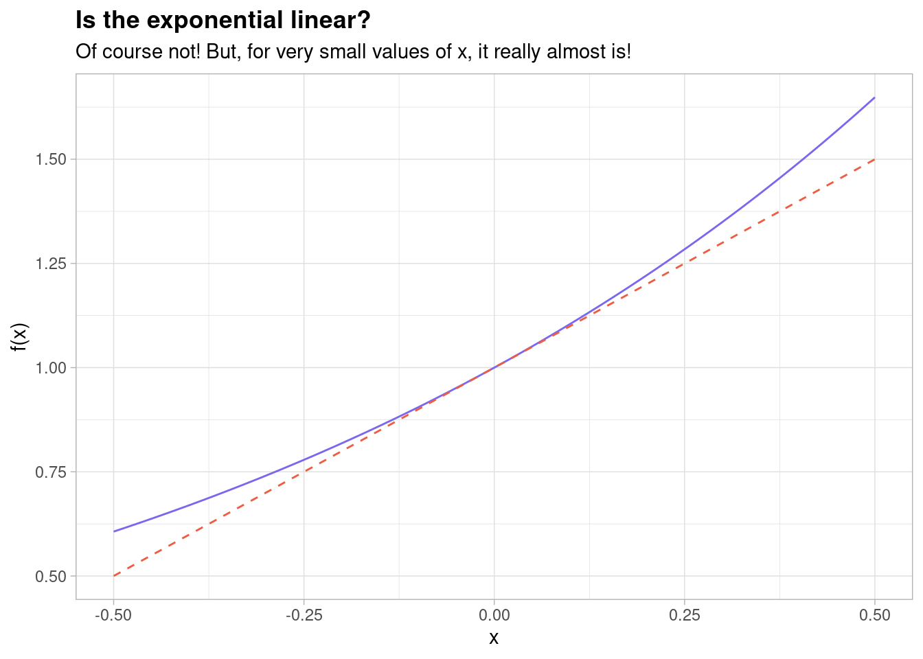
Indeed, it is clear from this that for very small values of \(x\) (e.g. \(x = 0.01\)) these lines are indistinguishable to the human eye!
At this point, let’s go back to the mapping of normally distributed random variables to log-normally distributed random variables and recall that they are related by the exponential function \(exp(x)\),
We’ve just shown that \(exp(x) \approx 1 + x\) or, equivalently, that \(exp(x) - 1 \approx x\). So if we translate this mapping by ‘shifting’ all of the log-normal instances down by 1, we should be able to see an almost identical correspondence between both distributions for small values of \(x\),
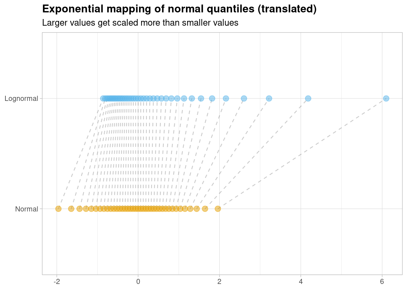
We can highlight the points which fall within the \([-0.50, 0.50]\) range as this is where the relationship is strongest, visually,

Just look at how straight the lines are for small values of \(x\): the log-normal and the normal distribution are basically indistinguishable at this level of precision.
More crucially however, as this diagram makes crystal clear: these distributions are not the same! They might look the same for small values of \(x\) but they are very different distributions for larger values of \(x\).
Notice that larger instances of the random normal variable are being mapped to much larger values on the log-normal equivalent. This is a very important result that finally allows us to revisit the original question we had.
Revisiting the stock plots
Let’s look at these plots once again,
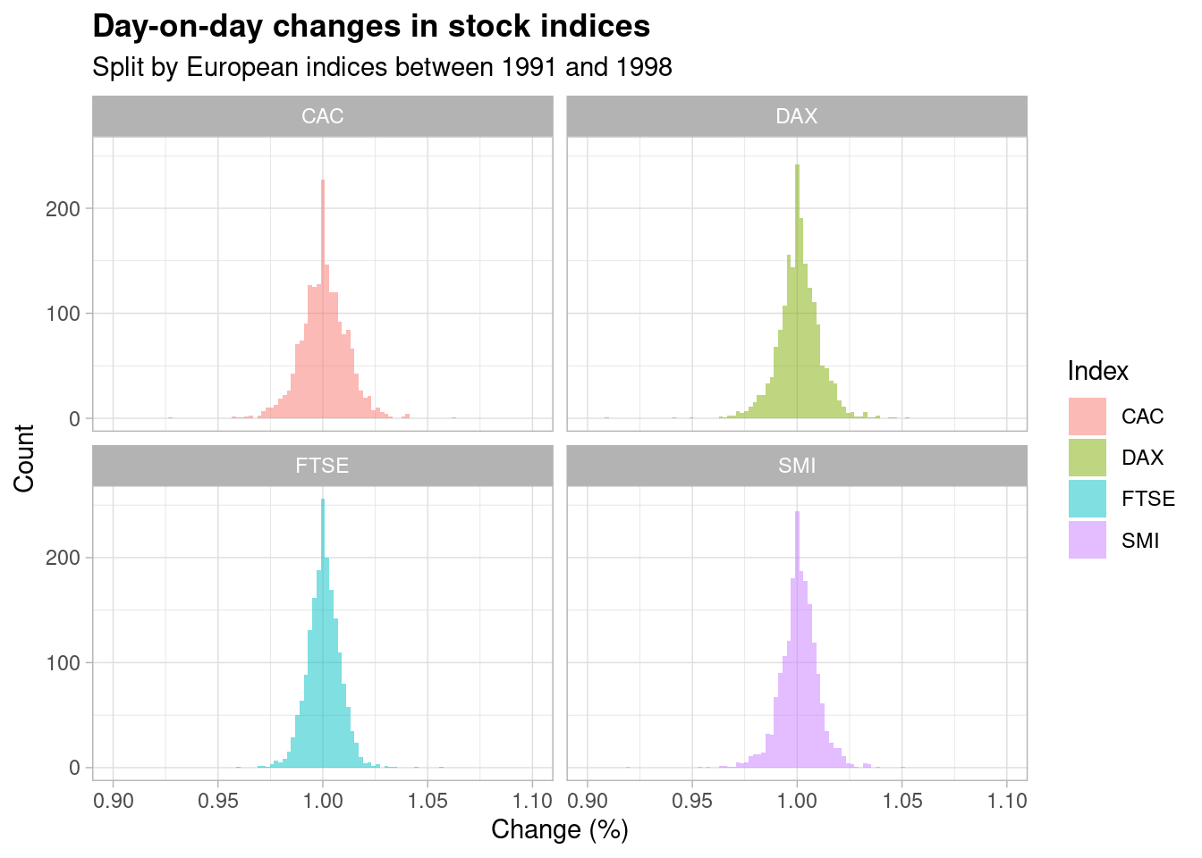
Notice that the returns (which are simply equal to the day-on-day change minus \(1\)) are, in general, very, very small - the most common day-on-day change is a factor of \(1\) and \(1 - 1 = 0\). However, we’ve just established through careful analysis that the normal distribution is incredibly close (but not technically identical) to the log-normal distribution for very small values of \(x\).
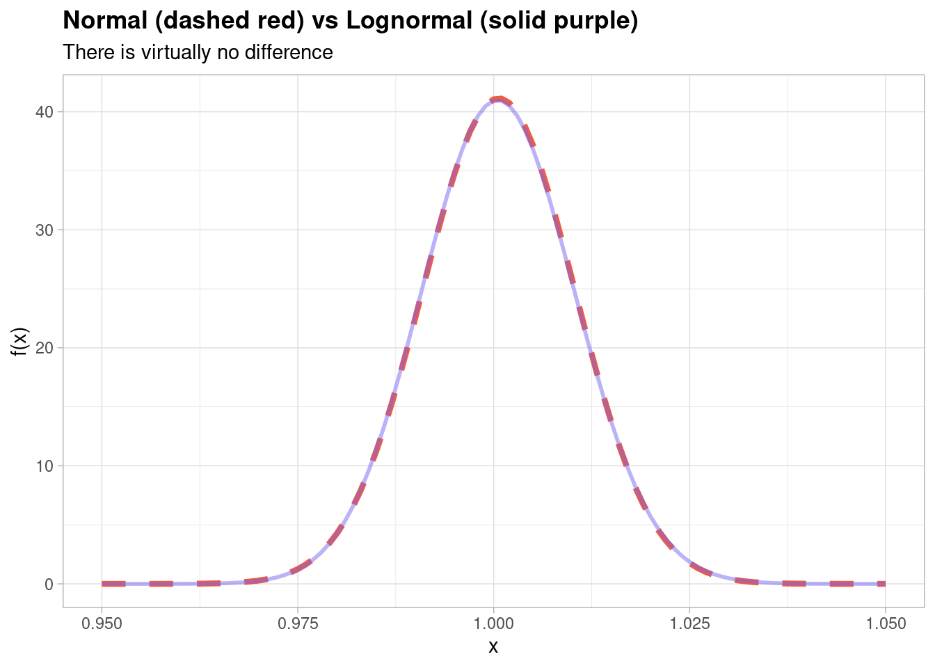
The thing is, since every single day-on-day change is so incredibly small (no more than 5% in each direction at its most extreme), at this microscopic level there really is virtually no difference in the distribution and you can show that by fitting a normal distribution and a lognormal distribution to the data itself,
Part of the reason that the range of values is so tiny is because we are looking at day-on-day returns: the time horizon is so small. If instead we opted to examine a longer time horizon then, in theory, then we may have observed a more ‘skewed’ distribution with a greater volatility of returns.
And that, my friends, is an exercise that I will leave for you to finish off in your own time!